


CSS3 properties
CSS hacks...
CSS3 FTW!

Properties
box-sizingcontent-box(initial): The width and height properties are measured including only the content, but not the padding, border or margin.border-box: The width and height properties include the padding and border, but not the margin.padding-box
html {
  box-sizing: border-box;
}
*, *:before, *:after {
  box-sizing: inherit;
}
width: *-contentmax-content: The element width grows with the width of the content similar to an inline element like <span>min-content: The width of the element contracts to the narrowest possible width the content allowsfit-content: The larger of: 1the intrinsic minimum width, and 2the smaller of the intrinsic preferred width and the available width
<blockquote class="width-max-content">
  A girl gives a man his own name?
</blockquote>
<blockquote class="width-min-content">
  The Lannisters send their regards.
</blockquote>
.width-max-content {
  width: max-content;
}
.windth-min-content {
  width: min-content;
}
A girl gives a man his own name?
The Lannisters send their regards.
Objects
Properties for objects: images, videos, and embeds.
object-fit- Determines how objects fit within their defined with/height or container.
fill(default): fill the entire space, ignore aspect ratio

contain: expand or contract the image, maintaining aspect ratio.cover: expand or contract until it covers the width and hight while maintaining aspect rationone: ignore the box width and hightscale-down: Scale the image until it either fits within the box size (contain) or reaches its original size (none)...object-position- Position the object within the box
- Accepts a
<position>coordinate liketop,bottom right,10px 20px,50% 10%, etc. The initialobject-positionis50% 50%.
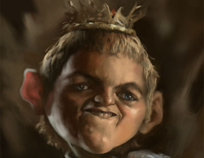
(Via Chris Nager; "joffrey" © lamwin@deviantart)
Values and Units
calc()- Mathematical expressions with addition, subtraction, multiplication, and division
:root {
  font-size: calc(100vw / 40);
}
toggle()- Allows descendant elements to cycle over a list of values instead of inheriting the same value.
em { font-style: toggle(italic, normal); }
ul {
  list-style-type: disc;
}
ul ul {
  list-style-type:
    toggle(disc, circle, square, box);
}
attr( attribute-name <type-or-unit>? [, <fallback> ]? )- Applies the value of an HTML or XML attribute such as data-*.
- ლ(ಠ益ಠლ) Meager browser support (polyfill)
<stock>
  <wood length="12"/>
  <wood length="5"/>
  <metal length="19"/>
  <wood length="4"/>
</stock>
stock::before {
  display: block;
  content: "The lengths of materials are:";
}
stock > * {
  display: block;
  width: attr(length em); /* default 0 */
  height: 1em;
  border: solid thin;
  margin: 0.5em;
}
wood {
  background: orange url(wood.png);
}
metal {
  background: silver url(metal.png);
}